(This kit is no longer for sale, but we’re leaving this up as a part of our history)
It’s that time of year again. Time to put our new kit out into the world and tell people what we’ll look like for at least the next twelve months. There is a bit to cover here, so let’s get right to it!
Rodeo 3.0 tries to roll everything that we’ve covered over the last two years into an updated look. I didn’t want to lose our most important identifying characteristics, but I also don’t want to dwell too much on old material. Now that we have a bit of history under our belt it is clear that Rodeo is more about adventure than any other facet of cycling. Yes, we race sometimes. Yes, we geek out on gear. Yes, we enjoy the whole spectrum of the sport. But if we are known for anything it is for our generally adventurous style of riding. Dirt, tarmac, snow, dry, wet, flat, hilly. We feel at home outside knee deep in the elements, preferably on roads less traveled.
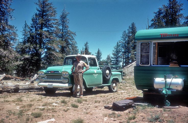
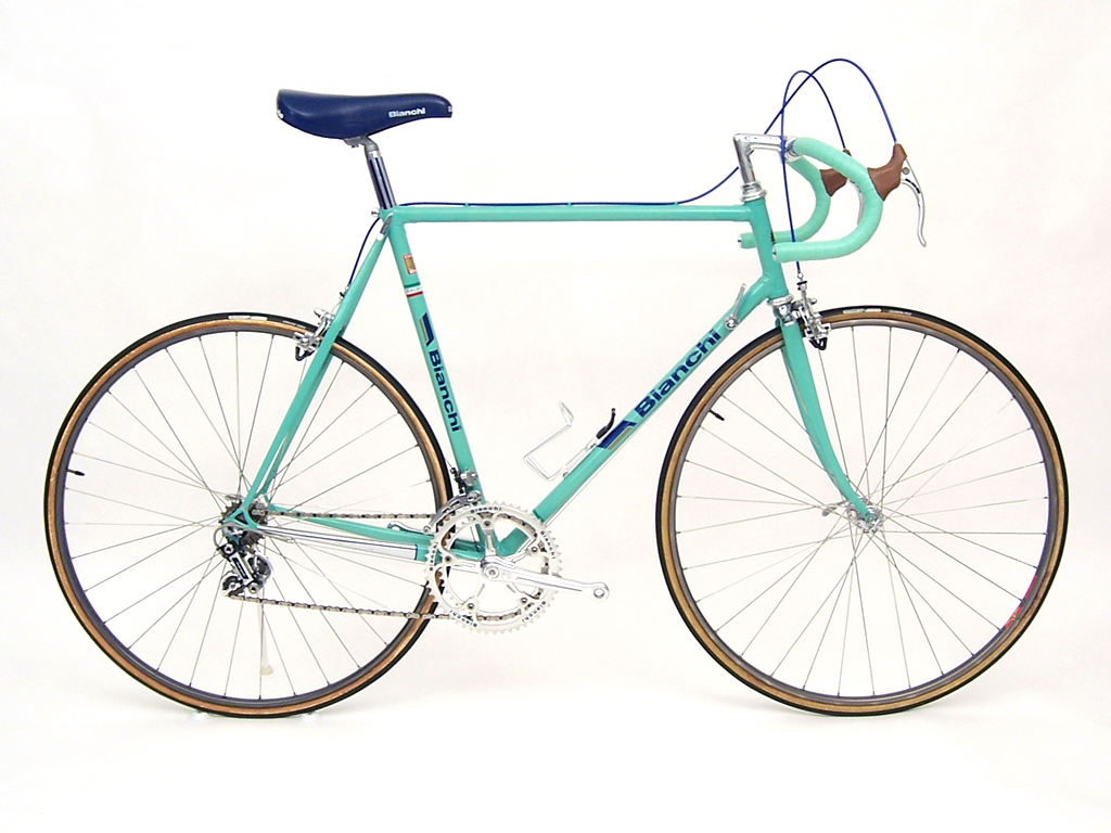
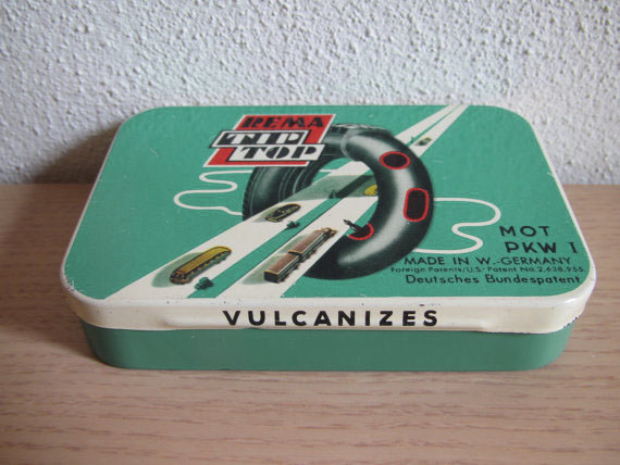
I always loved the classic U.S Forest Service green color. It invokes a bit of wild for me. It makes me think of the ’50s, ’60s, log cabins, camping, and alpine forests. The thought of hearty rangers out in the forest tending to parks and animals is a nice image. Forest Service Green probably a polarizing color in itself, some people may not like it at all, but I’m not worried about that. This green also reminds me of course of Bianchi, itself a company and brand that is second to none in history. Oddly, this color also reminds me of patch kits, but in a good way. Not the new patch kits, the old ones where you have to use vulcanizing glue and you have to wait a bit for the bond to set before re-inflating.
So maybe 3.0 is about nostalgia for older, more enduring things, but it is also about looking forward.
Instead of continuing where we left of visually with 2.0, 3.0 seeks to tidy things up a bit. Instead of five animals we are starting with 3 animals this year. This simplifies things a bit and leaves room to play more later in the year with the other animals if we feel like it.
In addition to the animals we’re introducing mini divisions to the team this year. Just like last year I think it’s good to reflect that we don’t all ride the same way or with the same goals, so I created three faux divisions with which to express our differences.
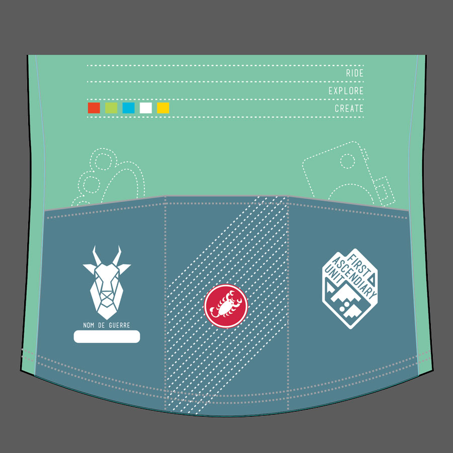
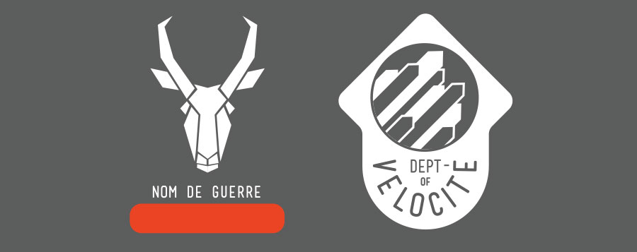
First up is the Department Of Velocité. No doubt this is spelled wrong. That’s ok, it’s made up. The Department Of Velocité is pretty simple: It’s about people who like to ride their bikes fast. Members of the department may find themselves racing from time to time, or a lot even. Members possibly sprint for city boundary signs. Members may or may not have a bunch of KOMs or at least find themselves high up on leaderboards. Even if none of those things apply, one of the things members enjoy most about cycling is the exhilaration of speed. The mascot associated with this group is the pronghorn, carried over from 2.0. The pronghorn is of course the second fastest land animal in top speed and probably the fastest animal in the world in terms of top sustainable speed. Seems like a good fit! Orange is the color of Velocité, because orange is fast.
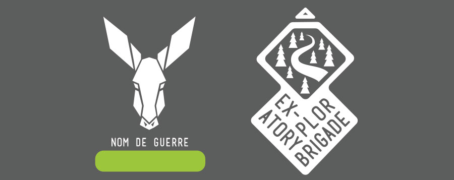
Second up is the Exploratory Brigade. Rodeo explores a lot. We may not uncover any places that have never before been trodden or ridden, but we actively seek out places that are new to us. Members of this department may find themselves staring at maps a lot, or more often ignoring maps and paying the price for it. Losing four hours staring at double track dirt roads on Google Earth might mean that you belong in this unit. Staring out of an airplane window and vowing to find whatever road it is that you see down there and ride it some day gets you Exploratory membership for life. The mascot for this group is the Traildonkey. Does this even need explaining? Donkeys aren’t the fastest beasts in the land but they’ve been dependable beasts of burden, transport, and exploration for centuries, and will continue to be so for many more. Green is the color for the Exploratory Department, because trees.
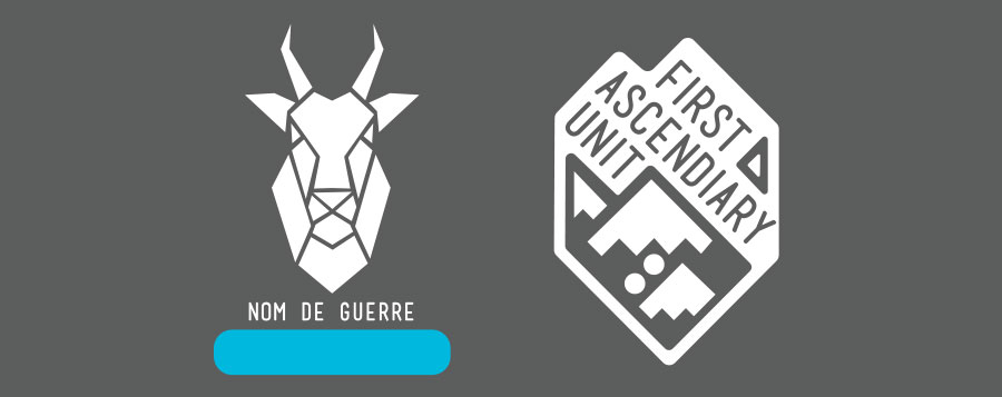
The final group for 3.0 is the First Ascendiary Unit. Not to be confused with the Incendiary Unit, which does not exist on our team. The Ascendiary unit is a nod to people who like going up hills. They feel called to ride their bikes deliberately up the tallest thing on the horizon and then they do it again over and over because they are good at it. Climbing hills is very Rodeo. You don’t have to be fast at climbing to be good at it, you just have to be willing to do it and when you do you feel the deep satisfaction of temporarily overcoming gravity. Some of the best rides out there lay just over the next hill. The First Ascendiary Unit enjoys earning those rides. The mascot for this unit is the Mountain Goat. Mountain goats live very very high up. If you see one you know you’ve done some serious climbing. Mountain goats are natural born climbers and are comfortable on near vertical inclines. The color for this unit is blue because the sky is blue, and if you climb all day you’ll touch the sky.
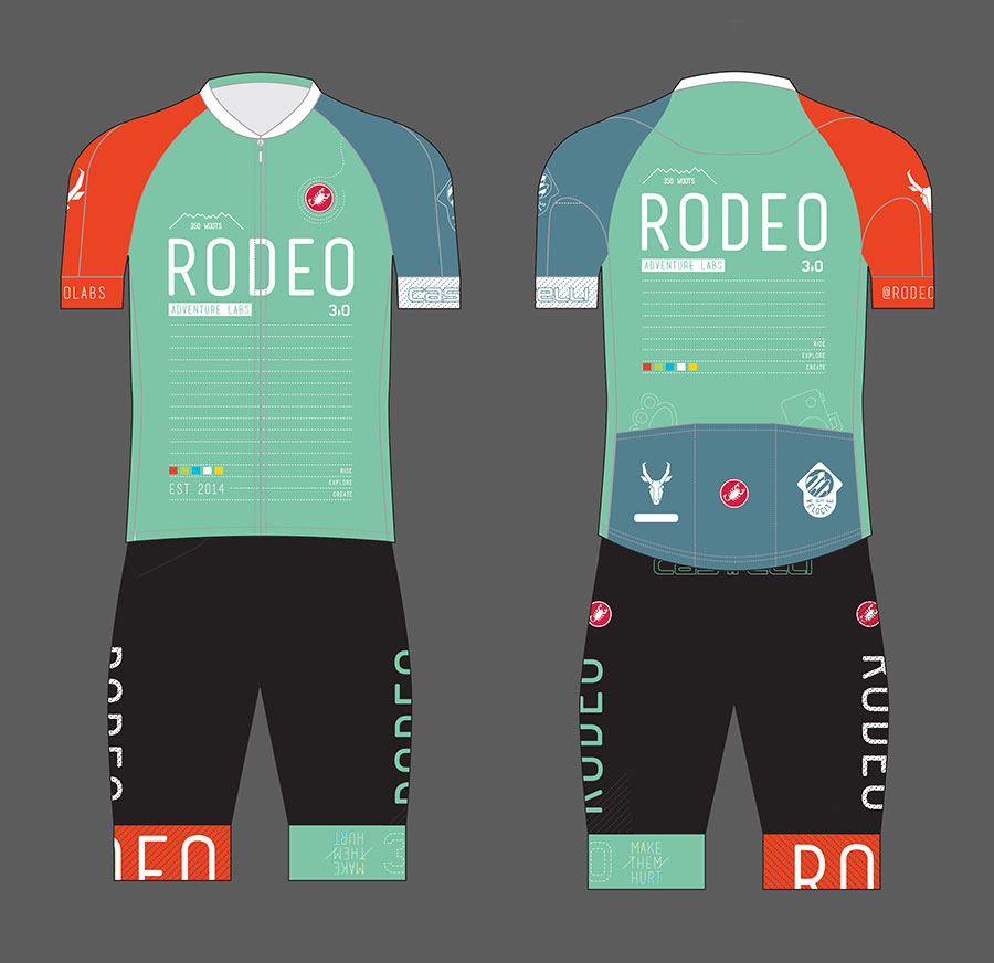
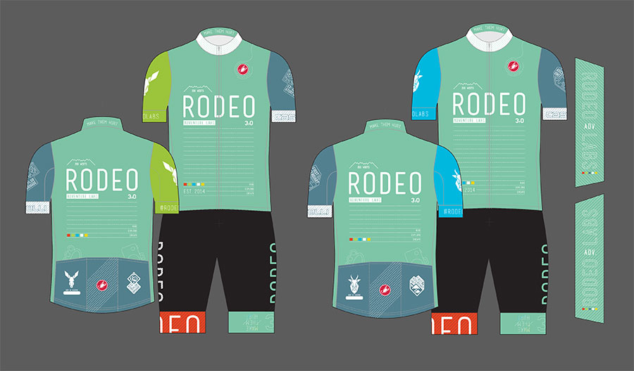
Let’s get onto the kits. Here’s a good look at the main show featuring Castelli’s freshly redesigned Aero Race 3.0 shorts and the excellent redesigned Training Jersey. We tried both on and they really are nice upgrades from 2014 offerings.
In the graphic mix are our various insignia. “350 woots” is back, It’s one of our mottos. Our five color blocks are stashed on front and back. “Make Them Hurt” now lives on the inside AND the outside of the upper collar. @RODEOLABS gets a place on the sleeve so people know where to find us. On the back we kept the brass knuckles for toughness and the camera because “pics or it didn’t happen”. On the back pockets are once again our group insignia but there is also a white space left blank for each rider to fill in with their Nom De Guerre. We suggest a nice fresh permanent marker for application. The less serious the nom the better. Last but not least our three word values are featured front and back: Ride. Explore. Create.
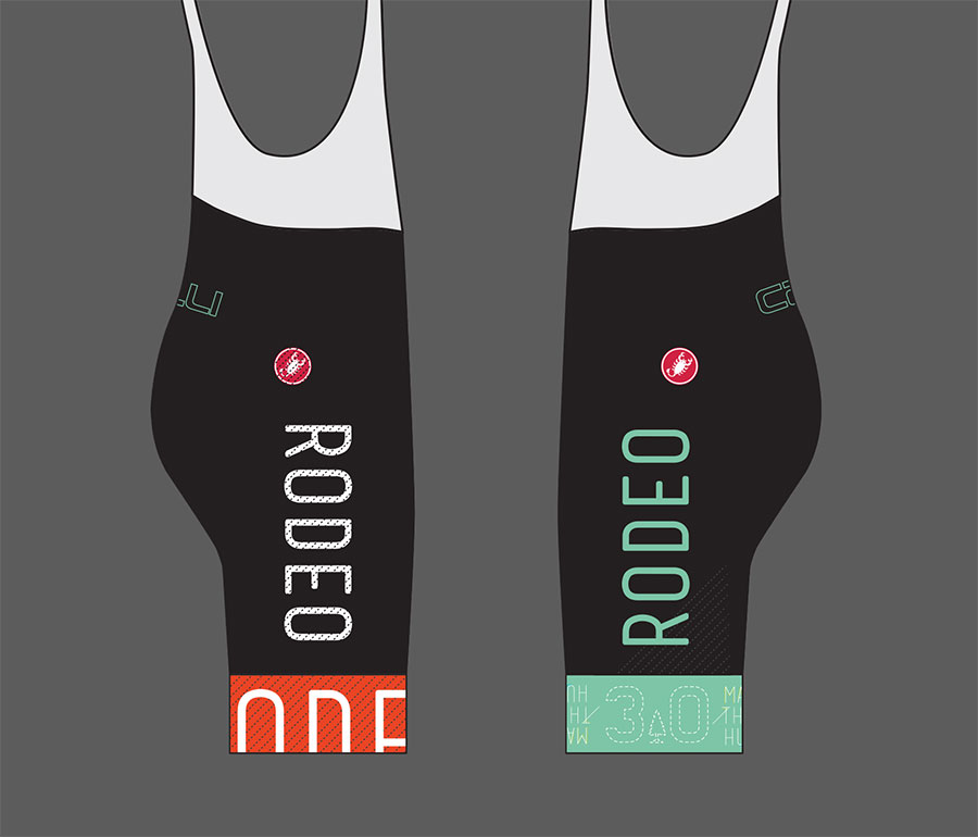
On the shorts we kept things mostly classic black. Of note the Make Them Hurt slogan is oriented on the front of the leg so that you can read it on the bike, but on the back of the leg it is oriented so that people behind you can read it.
And that’s pretty much it. I really wanted to keep things simpler this year in hopes that the design holds up well to time, and because I don’t think we have to try overly hard to make a graphic statement. I think in any given peloton these colors will stick out and be easy to spot and that is important for Rodeo, because we want to at least to try to have our own aesthetic and to have our own thing to say.
Below is the new Aero Race jersey with the new Aero Race shorts.
There will be three jerseys designs and on each the accent color, animal, and department logo changes. Seen together we will look like a team, but on a second glance our differences will also show.
Below are the Training Jerseys paired with the Aero Race or Team Shorts (They look very similar).
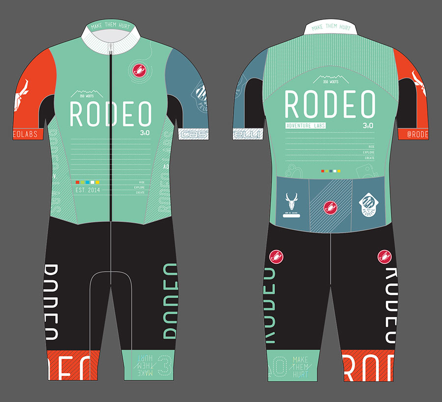
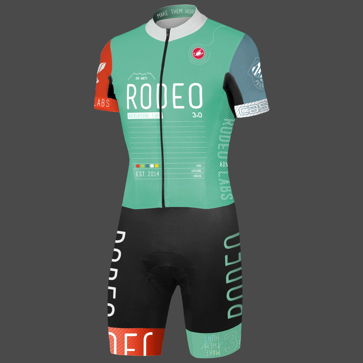
Below is the San Remo Road Suit front and back.
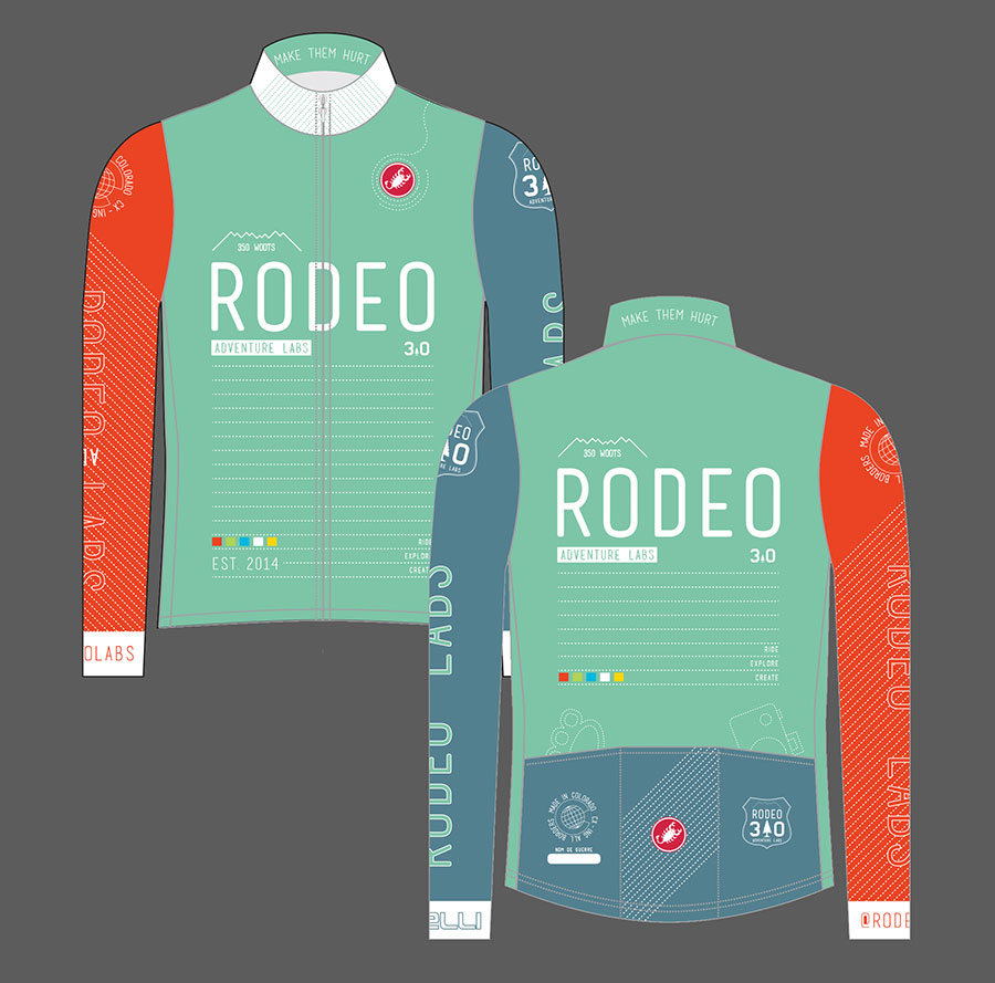
The long sleeve jersey doesn’t feature an animal or division since it would be worn by pretty much anyone who’s cold regardless of whether they are climbing, descending, exploring, or sitting around drinking coffee. In place of division graphics is our Crossing All Borders graphic from 1.0 and the general 3.0 shield. We kept an orange sleeve because orange looks cool. Design rules are made to be broken.
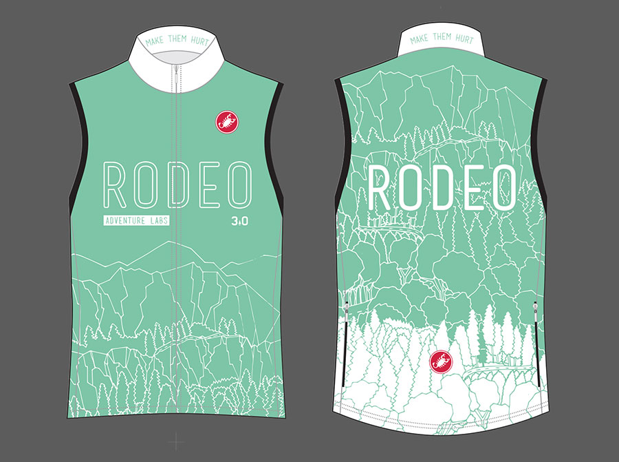
For the 3.0 wind vest it’s time to go in a related but different direction. We could have just done the graphics from the jersey and called it good. (Actually, that’s what we did but I changed it just now). We don’t have any sponsors to please we can do whatever we want with the vest, so let’s have some fun and interrupt the discipline of the main kit. Fitzfarm was commissioned to create a hand drawn scene with an adventurous vibe and she delivered. Mountains, trees, and forests are traversed by a single road climbing upward… to who knows where. The back gets the full treatment and the front is dialed back just a bit. The result is a vest that is a bit more fun and a bit more human than our previous vests. This will be our first ever piece of kit with the artists signature on it.
This year the kits will again be made by Castelli Cycling, our manufacturer since day one. Castelli updated their line this year so we’ve got some new bits in the mix:
- The Aero Race short got updated to Aero Race 3.0. It has nicer fabrics, better cuffs, and the same great Progetto camois.
- The Team Short also got updated this year and it is MUCH MUCH better than the previous version. It is almost as good as the Aero Race, but it uses a less expensive chamois.
- The Training Jersey will replace the Team Jersey for us this year. The Training jersey has a really nice fit and better cuffed sleeves. If you are used to wearing a certian size Team Jersey, you’d probably go one size down for the Training Jersey because it has a different cut and fits much more loosely than the equivalent Team Jersey size.
- The San Remo is back. Need we say more? It’s the fastest most comfortable, most practical speed suit out there and we love it. Horray for pockets! Same construction as 2015, which is a good thing.
- The Wind Vest is the same great fabric and construction but with 3.0 graphics
- The long sleeve jersey feels a bit softer this year. We aren’t sure what changed but it is nice. It has a slightly looser fit, presumably because you might be layering beneath it. (?)
- Aero Race jersey got a big update. New cuts, new fabrics. It is definitely a tighter race fit so if you aren’t serious about speed and fit, this might not be the jersey for you.
Shorts side detail:
Rear pocket detail: